 Tavern Tab
Splitting the bill,
without the fight.
A group-expense app that reframes the awkward money talk as a shared adventure, so every traveler always knows who paid, who owes, and how much.
The problem
On group trips, one person keeps fronting the costs and nobody remembers who owes whom. The math gets messy and the money talk gets awkward.
The solution
One shared ledger for the whole group. Every expense lives in one place, and the app resolves the fewest transfers needed to settle up, so accounts stay clear.
My role
End-to-end product designer, from problem definition and information architecture through flows, UI, and a working, buildable prototype.
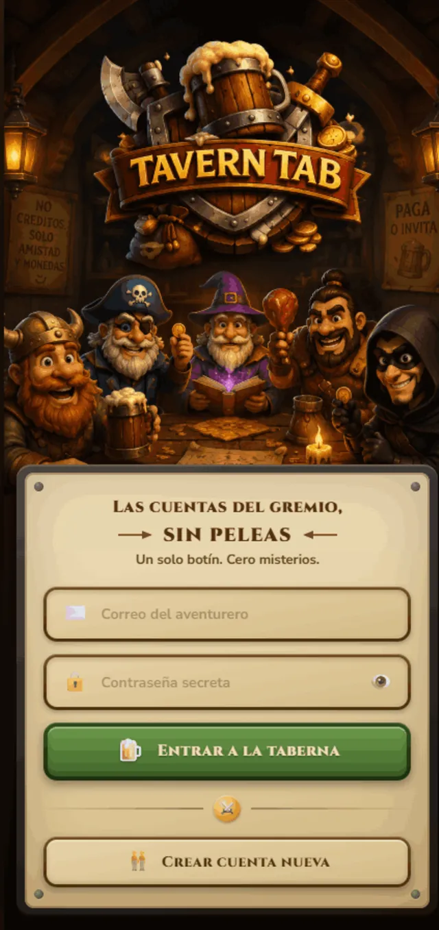
Money apps feel like spreadsheets. So I made this one feel like a quest.
Asking friends to pay you back is socially awkward. I reframed the group as an adventuring party and expenses as loot, turning a tense money conversation into a playful ritual. The tavern world does emotional work: it lowers the friction of the ask.
Each member picks a class with an avatar and motto, giving the group identity and warmth.
A single source of truth per trip keeps the mental model simple, with no parallel tallies.
Settlement computes the fewest transfers to make everyone even, framed as a group ritual.
Playful framing lives in the shell; numbers, rankings and charts stay clean and legible.
From joining the tavern to settling the tab.
The core loop: create a trip, log shared expenses, and let the app resolve who owes whom.
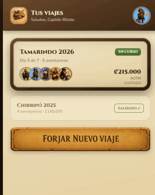
Every adventure, its own treasury
The home screen lists each trip as a card with its party, status and total spent, so the group can jump straight into the tab that matters.
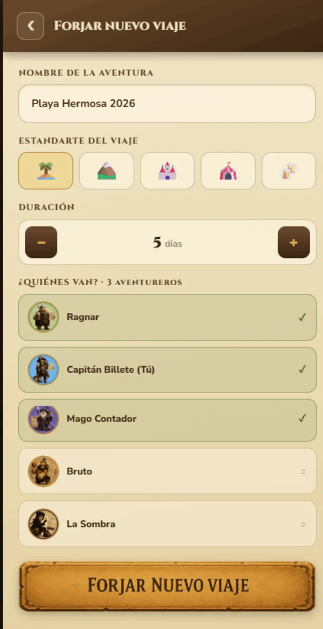
Name it, and pick your party
Setting up a trip is three quick choices: a name, a banner, and who's coming. Defaults keep it fast; everyone's in with one tap.
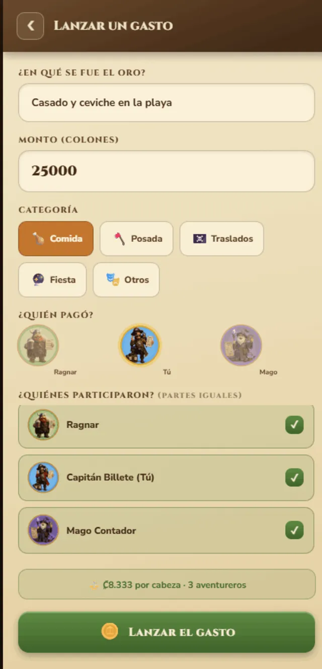
Who paid, what for, and who splits it
One form captures the whole expense: amount, category, the payer, and who shares it, with a live per-head preview so the split is never a surprise.
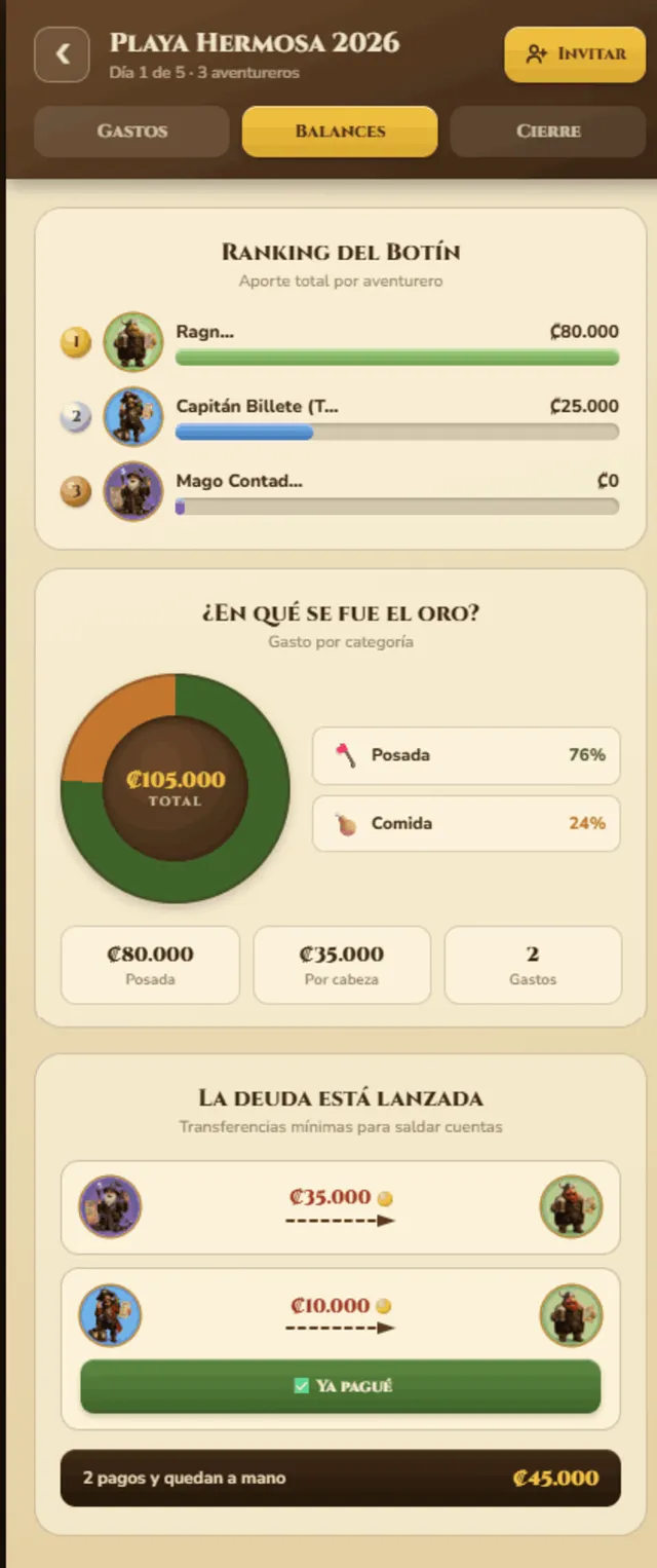
Clear accounts, at a glance
A ranking shows who contributed what, a donut breaks spend down by category, and the settlement plan lists the minimum transfers to make the party even again.
A metaphor can carry a whole system
Committing to the tavern world early gave every screen, label and empty state a consistent voice, and made a finance app feel approachable instead of clinical.
One source of truth beats clever features
Keeping every trip to a single shared ledger removed whole classes of confusion. The simplest mental model was the most valuable design decision.
Theme and clarity can coexist
The hardest balance was personality vs. legibility. Keeping the playfulness in the chrome and the data crisp let the app feel fun without ever feeling unreliable.
The full flow, in 37 seconds.
A guided walkthrough of the whole journey, from joining the tavern to settling the tab.